| A Tinderbox Reference File : Misc. User Interface Aspects : Map - Container Plots |
Map - Container Plots |
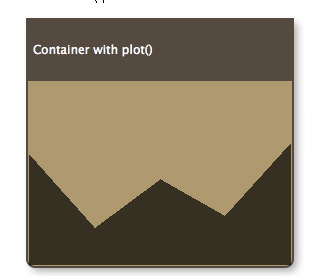
A new pattern for v 4.5.0, and which applies only to containers (notes & agents), is plot(). It evaluates an expression using data from each child of the containers to produce a graph. The graph, in the forms of a sparkline-type plot is drawn across the viewport area of the container. The graph is drawn in color PlotColor. The container viewport is still accessible for drag/drop, etc. as if the plot weren't there - think of the plot as an overlay. For example, to graph the word count of each child note in the container, see the container's map Pattern attribute to: An alternate plot type is bargraph(), which draws a bar graph of each child item's value. Both operators accept optional minimum & maximum values: plot(attribute,min,max) Thus: graphs the word count of each note whilst ensuring the Y-axis is based at zero, with all attribute values including the maximum being plotted. note that while zero is the default value of an 'blank' number type attribute, the type allows minus values. The above example would treat all of them as if their value were zero. graphs the data from a baseline of 10 to a maximum value of 900. Values outside these are plotted appropriately as the min or max values. From v4.5.2, plot/bargraph patterns are ignored if applied to non-container notes. |
 |
| Up: Misc. User Interface Aspects | |
| Previous: Map - Adornments as Dividers | Next: Map - Table Display |

